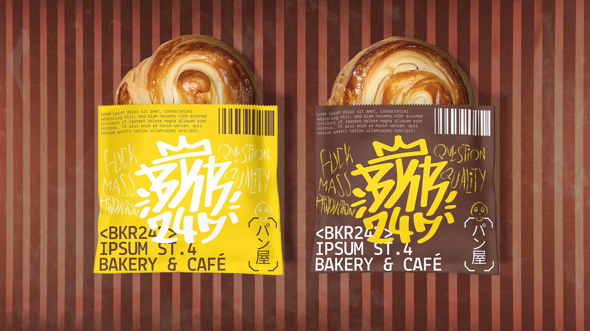
NAMING // BKR247
MAIN COLOUR // BROWN: #5D352A, 50-75-75-50
SECONDARY COLOUR // YELLOW: #FFD803, 0-13-100-0
ACCENT COLOUR // WHITE: #FFFFFF, 0-0-0-0
SPECIAL COLOURS // NONE
MAIN FONT // LEKTON REGULAR & BOLD
SECONDARY FONT // NONE
DECORATIVE FONT // NONE
PERSONALITY // OUTLAW, HERO
PILLARS // ARTISAN PASTRIES AT ALL TIMES
PURPOSE // THE QUALITY PRODUCTS YOU DESERVE
VALUE // OPEN ALL DAY AND NIGHT JUST FOR YOU
CLAIM // NO AUTOMATED BULLSHIT, WE KEEP IT REAL
> BRIEFING // Coming from an anti-mass-production standpoint, BKR247 aims to turn high-quality buns, pastries and coffee into something that's easily available in a city where you can hardly find any organic stuff. Their brand had to be as vocal as they are about their beliefs, while making it clear that they value technology and use it for the best.
> APPROACH // It was somewhat clear from the start that this project would benefit from the "low life, high tech" concept that cyberpunk is known for. As such, a brand strategy was thoroughly planned and developed in order determine how to approach it while making sure that it'd have a solid foundation behind. Just looking good would've been a failure.
> SOLUTION // The final result is a hybrid of punk, graffiti, sci-fi and a bit of Swiss design that has been glued together by a cyberpunk narrative. This makes it so that BKR247 can stand out while being true to itself; it's straightforward with whatever information they need to make available, but also has room for self-expression and custom messages.
> DISCLAIMER // Due to creative considerations certain logo variations, icons, images and / or texts may have been updated, excluded or not designed. Additionally, please note that the projects featured in this website are entirely fictional and have been custom-made in order to protect every client's privacy and anonymity.