NAMING // Borecide Café
MAIN COLOUR // DARK PURPLE: #261D27, 75-75-50-75
SECONDARY COLOUR // BEIGE: #FFFAD2, 0-0-25-0
ACCENT COLOUR // NONE
SPECIAL COLOURS // NONE
MAIN FONT // LEKTON REGULAR & BOLD
SECONDARY FONT // NONE
DECORATIVE FONT // NONE
PERSONALITY // EXPLORER, CAREGIVER
PILLARS // A COFFEE SHOP FOR CREATIVES
PURPOSE // JUST RELAX, GET INSPIRED AND CREATE
VALUE // MADE WITH LOVE FOR CREATORS
CLAIM // LET YOUR CREATIVITY RUN WILD
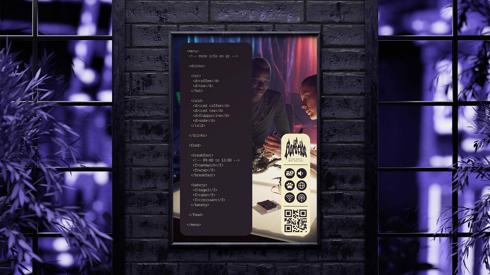
> BRIEFING // As its name implies, Borecide Café is a coffee shop — but what makes it special? Unlike similar businesses, this one was made for all sorts of creative people. It's a place where you can just sit down and create, without getting pestered to leave. The main challenge was to build something unique and bold, but also immersive and welcoming.
> APPROACH // A place like this had to be cozy and calm, meaning that everything should be easy to understand. As such, building a brand that would help with immersiveness and would never feel out of place was of utmost importance. In the end, these considerations led to the development of a brand strategy that'd guide the project moving forward.
> SOLUTION // Borecide Café ended up as a brand with a strong cyberpunk inspiration, due to its ability to learn from and incorporate all sorts of styles. It relies on cozy colours and a somewhat minimal style, with big photographies and HTML code inspiration. It all merges into a unique style that was designed with immersion in mind at all times.
> DISCLAIMER // Due to creative considerations certain logo variations, icons, images and / or texts may have been updated, excluded or not designed. Additionally, please note that the projects featured in this website are entirely fictional and have been custom-made in order to protect every client's privacy and anonymity.