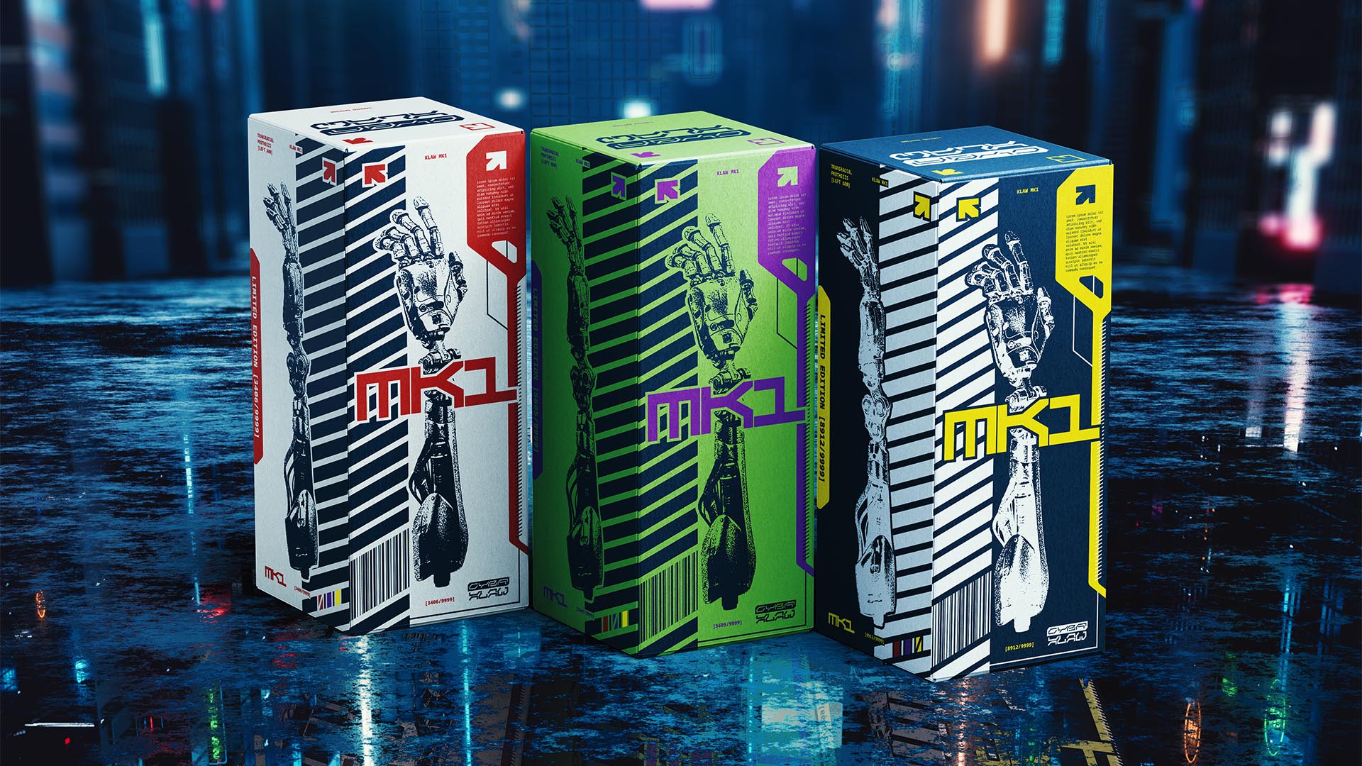
NAMING // CYBRKLAW
MAIN COLOUR // DARK BLUE: #1A2B3C, RAL 5011
SECONDARY COLOUR // WHITE: #FFFFFF, RAL 9003
ACCENT COLOUR // NONE
SPECIAL COLOURS // TWO FOR EACH RELEASE
MAIN FONT // NOTO SANS MONO REGULAR & BLACK
SECONDARY FONT // NONE
DECORATIVE FONT // FERRITE CORE DX DISPLAY
PERSONALITY // OUTLAW, ARTIST
PILLARS // CYBERPUNK-THEMED PROSTHETIC LIMBS
PURPOSE // THOUGHTFUL, USEFUL INNOVATION
VALUE // EXCLUSIVE, PRACTICAL, FRESH
CLAIM // KLAWS FOR UNRIVALED SPIRITS
> BRIEFING // From the necessity of providing people with high-quality prosthetic limbs came CYBRKLAW. It aims not only to develop affordable products that can be comfortably used on a daily basis, but also to turn it into a fun experience. It needed a brand had that was as unique as their products, thus adjusting to different preferences.
> APPROACH // From a strategic point of view, this brand's needs were very clear from the very start; not only did this make it easier to develop a good strategy, it also turned it into a very interesting project creatively speaking. It was ultimately decided that its main strength should be a unique use of colours, thus representing inclusivity.
> SOLUTION // CYBRKLAW ended up as a versatile brand; it's fun and playful, but also professional and inclusive. It intends to turn a necessity into something to be proud of, and its name helps in that regard. While it only has two colours to call its own, every single release uses two more in an experimental approach that really sets it apart.
> DISCLAIMER // Due to creative considerations certain logo variations, icons, images and / or texts may have been updated, excluded or not designed. Additionally, please note that the projects featured in this website are entirely fictional and have been custom-made in order to protect every client's privacy and anonymity.