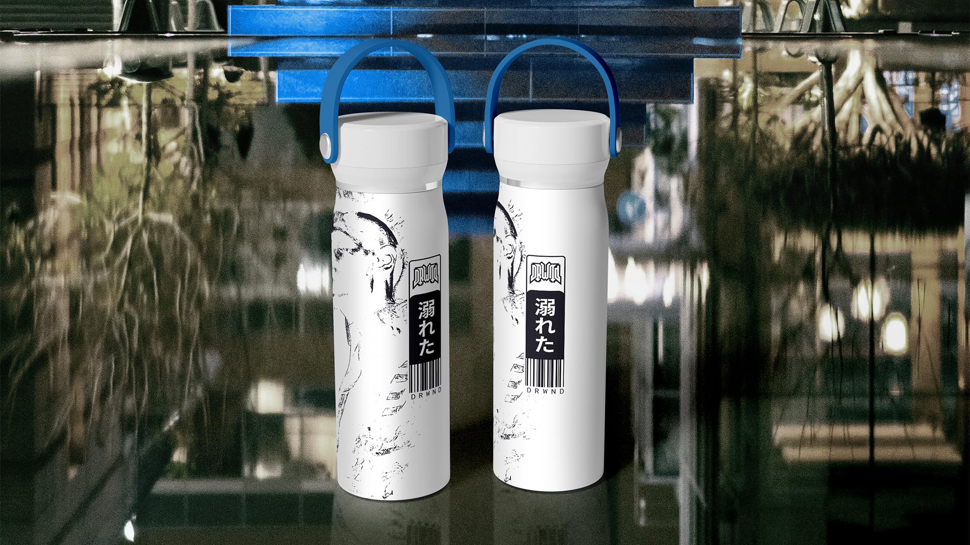
NAMING // DRWND
MAIN COLOUR // WHITE: #F6F6F6, RAL 9016
SECONDARY COLOUR // DARK BLUE: #26252D, RAL 5008
ACCENT COLOUR // BLUE: #3B83BD, RAL 5012
SPECIAL COLOURS // NONE
MAIN FONT // NOTO SANS REGULAR & BLACK
SECONDARY FONT // NONE
DECORATIVE FONT // NONE
PERSONALITY // EXPLORER, CAREGIVER
PILLARS // AIDING HEALTHY DRINKING
PURPOSE // PROVIDING WATER TO EVERYONE
VALUE // HEALTHY, RESPECTFUL AND DESIRABLE
CLAIM // REVIVE YOUR HYDRATION HABITS
> BRIEFING // Drinking water is really important for anyone's well-being, but not everyone realises it. DRWND aims to change that, raising awareness and contributing with organisations that improve people's lives. The main point here was that it had to be interesting, not just another healthy brand that ends up getting boring sooner than later.
> APPROACH // Developing a proper brand strategy was a key step to take in order to determine the way forward, which in this case ended up being relying on sci-fi to turn it into something unique and more desirable. More precisely, a cyberpunk approach was taken because of its fitting narrative and the potential it had in terms of storytelling.
> SOLUTION // DRWND, pronounced, "drowned", ended up being a brand that focuses on being simple and minimalist. However, it uses illustrations boldly to fill up some of the empty space that's left, making each product interesting and different from every other one. This way it's possible to have something for everyone without losing coherence.
> DISCLAIMER // Due to creative considerations certain logo variations, icons, images and / or texts may have been updated, excluded or not designed. Additionally, please note that the projects featured in this website are entirely fictional and have been custom-made in order to protect every client's privacy and anonymity.