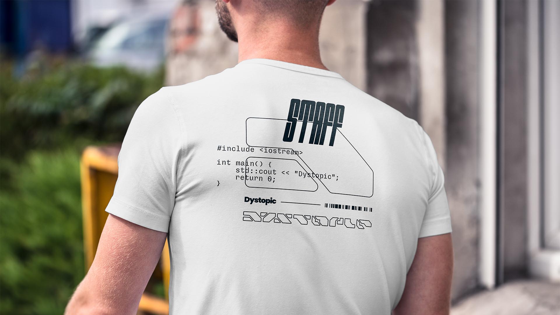
NAMING // Dystopic
MAIN COLOUR // WHITE: #EDEDED, 0-0-0-10
SECONDARY COLOUR // DARK BLUE: #00141E, 60-0-0-100
ACCENT COLOUR // NONE
SPECIAL COLOURS // NONE
MAIN FONT // SLIGOIL MICRO
SECONDARY FONT // NONE
DECORATIVE FONT // OUTWARD ROUND
PERSONALITY // EXPLORER, HERO
PILLARS // A THRIFT SHOP GONE CYBERPUNK
PURPOSE // UNIQUE AND AFFORDABLE OUTFITS
VALUE // EXPERTLY CURATED COMBINATIONS
CLAIM // THRIFT YOUR WAY INTO THE FUTURE
> BRIEFING // There often are great ways to save money, and that doesn't necessarily mean making sacrifices. Dystopic aims to offer affordable and expertly-curated cyberpunk-inspired outfits made entirely from slightly altered second-hand clothes. It's a sustainable yet bold project that needed a brand that'd be just as powerful and ambitious.
> APPROACH // Since this project's aim was being sustainable without making it their main selling point, from a creative point of view it offered an incredible amount of freedom; the two main aspects that had to get taken into account were immersion and, most importantly, the cyberpunk narrative that shaped this brand's unique selling proposition.
> SOLUTION // Just like clothes here get altered to craft something unique and better for the final outfit, Dystopic as a brand relies on making simple stuff cool by using a variety of elements. This allows them to capitalise on immersion while always being environmentally responsible and effective when it comes to working towards their objectives.
> DISCLAIMER // Due to creative considerations certain logo variations, icons, images and / or texts may have been updated, excluded or not designed. Additionally, please note that the projects featured in this website are entirely fictional and have been custom-made in order to protect every client's privacy and anonymity.