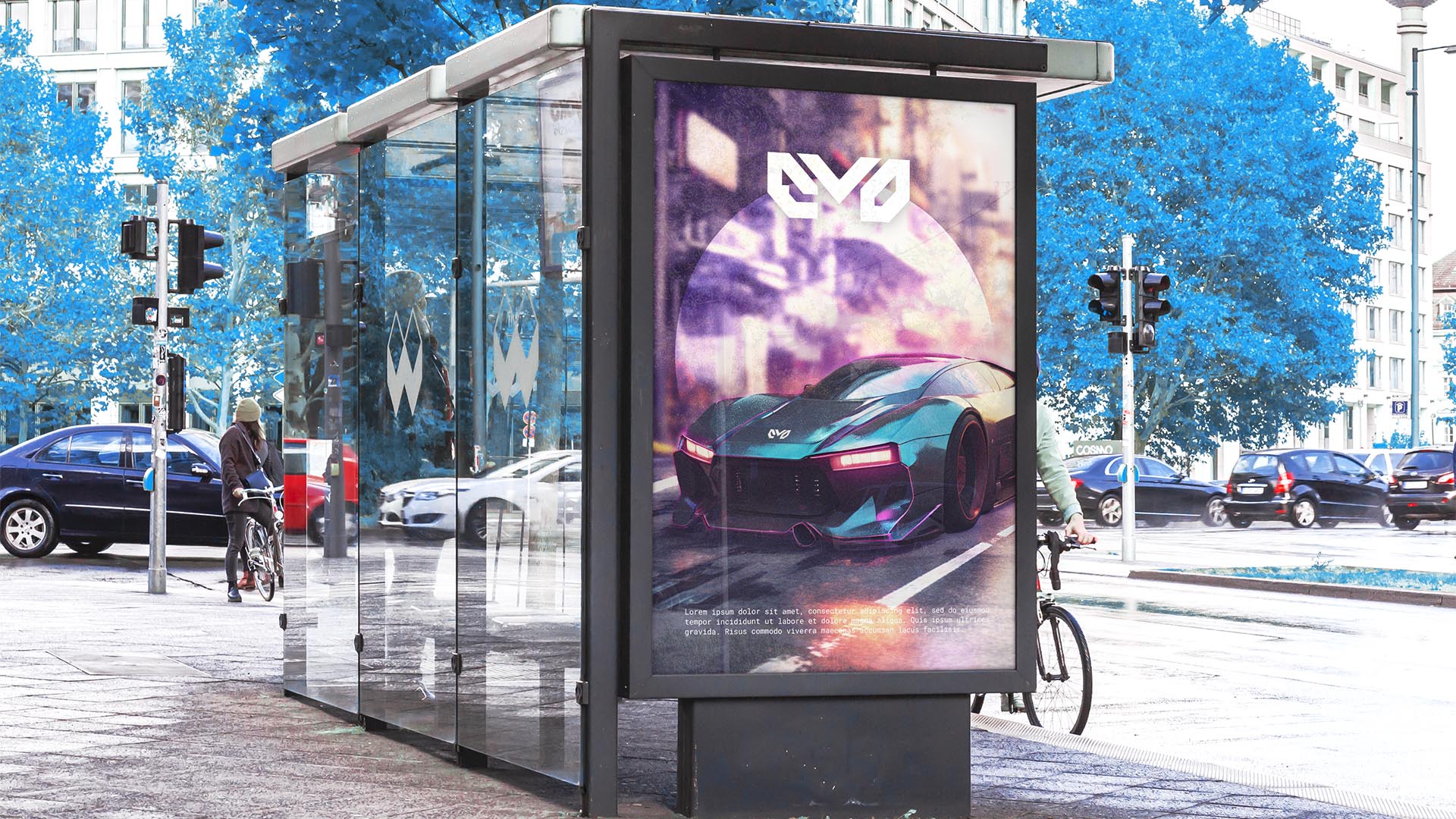
NAMING // [EVO]LVE, EVOLVE, EVO
MAIN COLOUR // BLUE: #0091EA, RAL 5012
SECONDARY COLOUR // BLACK: #000000, RAL 9005
ACCENT COLOUR // WHITE: #FFFFFF, RAL 9010
SPECIAL COLOURS // PINK: #E91E63, RAL 4010
MAIN FONT // ROBOTO MONO REGULAR & BOLD
SECONDARY FONT // NONE
DECORATIVE FONT // NONE
PERSONALITY // RULER, MAGICIAN
PILLARS // REINVENTING SPEED AND POWER
PURPOSE // PUSHING VEHICLES' LIMITS
VALUE // IT WON'T GO FASTER THAN EVO
CLAIM // THE WHEELS YOU'VE ALWAYS WANTED
> BRIEFING // This project originated from the thrill that speed inspires. A company that'd focus entirely on developing the fastest vehicles to date would also need a powerful brand that's just as bold; something vivid that'd inspire both speed and power, innovation in every way. It had to show that their approach is different from the very start.
> APPROACH // As something inspired by thrill, it was only fair to appeal to thrill seekers and not just anyone. Strategically, as already mentioned, this brand had to revolve around speed and power. Visually, however, it was fair to shift the focus to the concept of energy; however, before designing anything it was vital to develop a brand strategy.
> SOLUTION // For EVOLVE, or EVO, it was decided that versatility was a key requirement; as such, the result is a vibrant brand with a main colour that can be replaced with pink at any time. It also has a meaningful yet adaptable name, and a bold logo with an Easter Egg related to the Old Futhark rune Ehwaz, representing movement and progress.
> DISCLAIMER // Due to creative considerations certain logo variations, icons, images and / or texts may have been updated, excluded or not designed. Additionally, please note that the projects featured in this website are entirely fictional and have been custom-made in order to protect every client's privacy and anonymity.