NAMING // FANCY STONES
MAIN COLOUR // WHITE: #FFFFFF, 0-0-0-0
SECONDARY COLOUR // BLACK: #1D1D1B, 0-0-0-100
ACCENT COLOUR // NONE
SPECIAL COLOURS // VARIES FOR EACH PRODUCT
MAIN FONT // BDO GROTESK REGULAR
SECONDARY FONT // NONE
DECORATIVE FONT // NONE
PERSONALITY // ARTIST, JESTER
PILLARS // HIGH-END JEWELLERY REIMAGINED
PURPOSE // UNMATCHED STYLE AND QUALITY
VALUE // THE BEST CYBERPUNK ORNAMENTS
CLAIM // MADE TO BE WORN BY THE BOLD
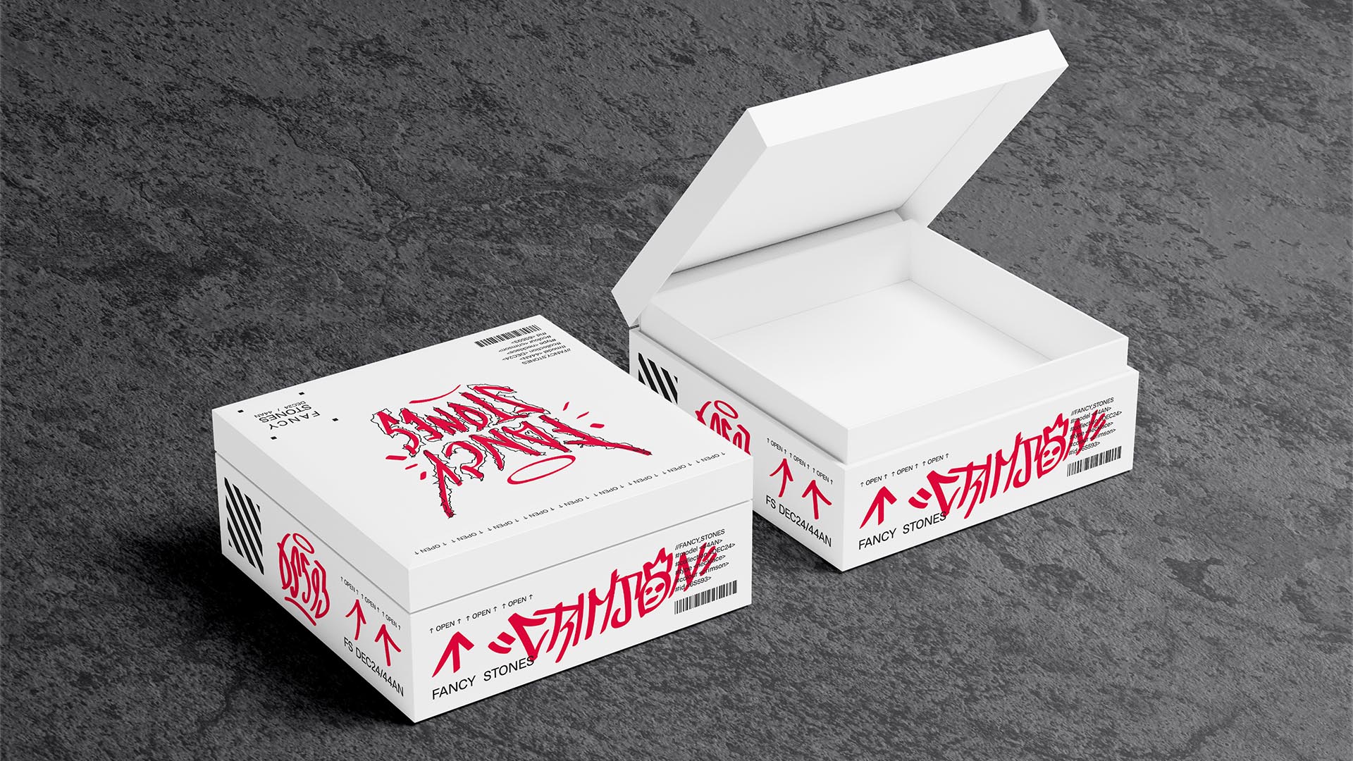
> BRIEFING // Judging by its name alone it might feel like this project is a parody, and it wouldn't be too far off. FANCY STONES needed a brand that was as bold as their idea; niche high-quality jewellery that doesn't feel like it's just another fancy brand with overpriced products. It was all about being different, disruptive and fearless.
> APPROACH // This brand would revolve around the sci-fi niche, but how exactly? After doing the proper research and developing a fitting strategy it was decided that, because of their disruptive spirit, the cyberpunk genre would be ideal. It'd allow for designs that'd incorporate punk-inspired elements, essentially making fun of top brands.
> SOLUTION // Combining a perfect hybrid of modern Swiss design and sci-fi with hand-drawn graffiti tag elements, FANCY STONES relies on coexistence to work. It's not meant to look unified, but rather have a vandalised look. It offers clients a unique experience as they'll see their carefully-designed jewellery packaging get drawn on in a custom way.
> DISCLAIMER // Due to creative considerations certain logo variations, icons, images and / or texts may have been updated, excluded or not designed. Additionally, please note that the projects featured in this website are entirely fictional and have been custom-made in order to protect every client's privacy and anonymity.