NAMING // IC5-CRM
MAIN COLOUR // WHITE: #FFFFFF, 0-0-0-0
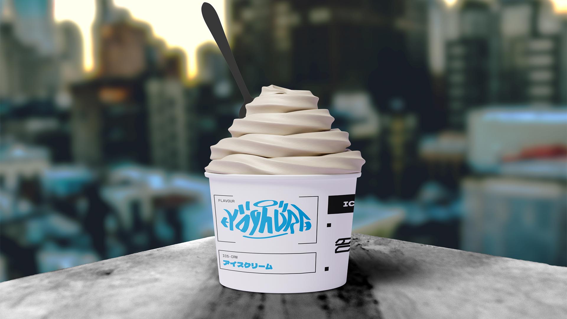
SECONDARY COLOUR // BLUE: #00B6ED, 75-0-0-0
ACCENT COLOUR // DARK GREY: #3C3C3B, 0-0-0-90
SPECIAL COLOURS // NONE
MAIN FONT // SPACE MONO REGULAR & BOLD
SECONDARY FONT // DELA GOTHIC ONE
DECORATIVE FONT // NONE
PERSONALITY // EXPLORER, EVERYMAN
PILLARS // CYBERPUNK ICE CREAM ESCAPADE
PURPOSE // COMBINING DESSERTS AND TECH
VALUE // MORE THAN A SCOOP, A JOURNEY
CLAIM // FREEZE YOUR CIRCUITS
> BRIEFING // Being an experience-oriented shop, IC5-CRM strives to turn something as simple as eating an ice cream into something memorable by doing things differently. They intend to reimagine everything by adding fun machines and automating boring processes, and having a fitting brand was just as important to reach their desired outcome.
> APPROACH // Upon seeing the role technology would play it became evident that using sci-fi as a major inspiration source would be key. However, going for something that's just futuristic could've been a mistake due to it not being original enough; in order to avoid that it was necessary to develop a good brand strategy before making any decision.
> SOLUTION // Aiming to find a middle ground, the visual identity of IC5-CRM combines futuristic elements designed to appeal to a broad audience with handmade graffiti tags that are unique for each cup and person. It's a playful and unique way to adapt cyberpunk's characteristic "high tech, low life" attitude to a setting that's family-friendly.
> DISCLAIMER // Due to creative considerations certain logo variations, icons, images and / or texts may have been updated, excluded or not designed. Additionally, please note that the projects featured in this website are entirely fictional and have been custom-made in order to protect every client's privacy and anonymity.