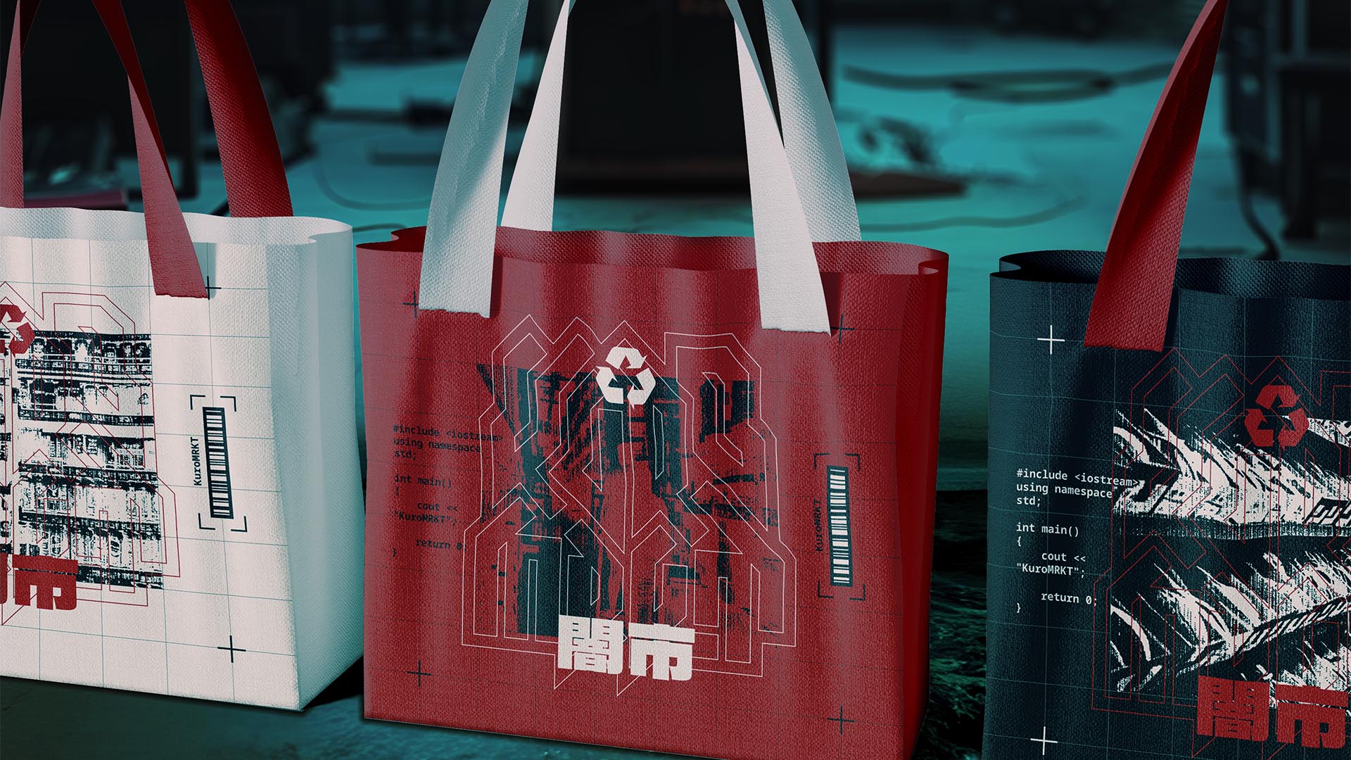
NAMING // KuroMRKT
MAIN COLOUR // BLACK: #1A1718, RAL 8022
SECONDARY COLOUR // RED: #BB1E10, RAL 3020
ACCENT COLOUR // WHITE: #F1ECE1, RAL 9010
SPECIAL COLOURS // NONE
MAIN FONT // NOTO SANS MONO REGULAR & BOLD
SECONDARY FONT // NONE
DECORATIVE FONT // DELA GOTHIC ONE
PERSONALITY // OUTLAW, MAGICIAN
PILLARS // A BLACK MARKET EXPERIENCE
PURPOSE // VANGUARD BRANDS NONSTOP
VALUE // WHAT NO ONE DARES TO SELL
CLAIM // RISE, WE WON'T HOLD YOU BACK
> BRIEFING // Some of the best ideas come from weird questions. What if black markets were legal? What would they look like? This is what inspired the creation of a market that sells products from promising underground brands. It was of utmost importance to double up on the taboo experience this business offers through the use of branding.
> APPROACH // Important as being able to express the right feelings is, focusing entirely on that would've been a grave mistake. Among other things, it was decided their unique approach to innovation was also particularly important. And what better way to deterine the best way forward than by first working on the development of a brand strategy?
> SOLUTION // KuroMRKT resulted in a bold while reasonable combination of elements and styles that don't always have something to do with each other. From thrash to sci-fi, it was all about finding what styles would work and why, and then pairing it with the right combination of colours in order to create the ideal visual identity for this project.
> DISCLAIMER // Due to creative considerations certain logo variations, icons, images and / or texts may have been updated, excluded or not designed. Additionally, please note that the projects featured in this website are entirely fictional and have been custom-made in order to protect every client's privacy and anonymity.