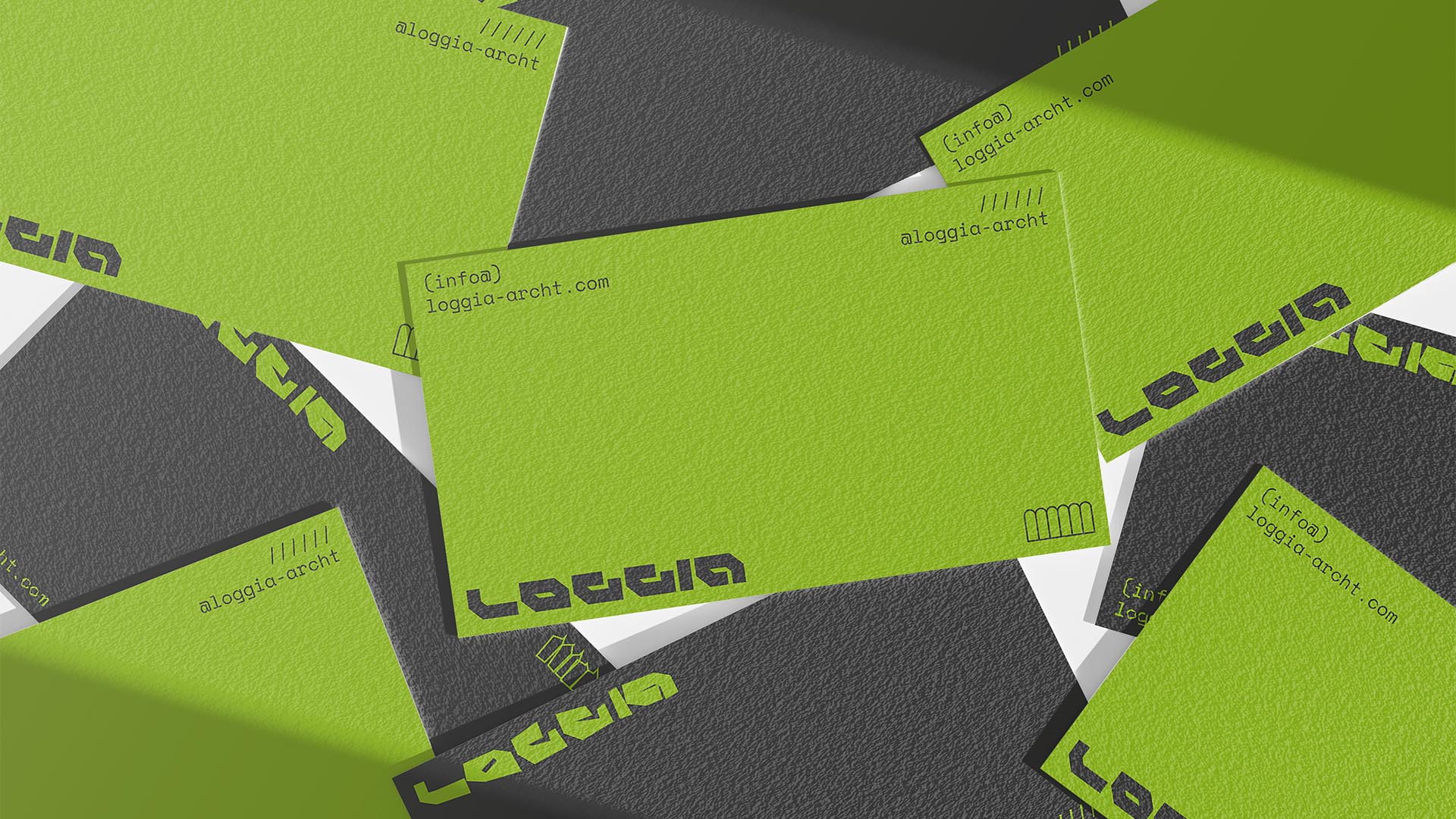
NAMING // LOGGIA
MAIN COLOUR // GREEN: #95C11F, 50-0-100-0
SECONDARY COLOUR // DARK GREY: #3C3C3B, 0-0-0-90
ACCENT COLOUR // NONE
SPECIAL COLOURS // NONE
MAIN FONT // SPACE MONO REGULAR & BOLD
SECONDARY FONT // NONE
DECORATIVE FONT // NONE
PERSONALITY // ARTIST, OUTLAW
PILLARS // DYSTOPIC BUILDING DESIGN
PURPOSE // THE HOUSE YOU DREAM OF HAVING
VALUE // A PERFECT SYNERGY OF STYLES
CLAIM // MAKE YOUR DREAMS COME TRUE
> BRIEFING // Having been heavily inspired by the impressive buildings that are often seen in sci-fi movies, LOGGIA aims to design unique living spaces that combine a big variety styles tin a futuristic yet dystopic fashion. This brand needed to have a flashy and creative spirit, while also being simple and as straightforward as possible at all times.
> APPROACH // When planning how to approach this project it became evident that its name and logo would most likely benefit from being core elements of the brand. The development of a proper strategy revealed that it was necessary to keep it clean but interesting, relying on small details to make sure it'd end up being as interesting as it should be.
> SOLUTION // LOGGIA's visual identity ultimately ended up revolving around using a lot of empty space, taking inspiration from headers and footers in web design. This way it's possible to distribute every necessary element in an way that addresses every issue and requirement, while simultaneously keeping it highly adaptable to about any format.
> DISCLAIMER // Due to creative considerations certain logo variations, icons, images and / or texts may have been updated, excluded or not designed. Additionally, please note that the projects featured in this website are entirely fictional and have been custom-made in order to protect every client's privacy and anonymity.