NAMING // Meal Hack
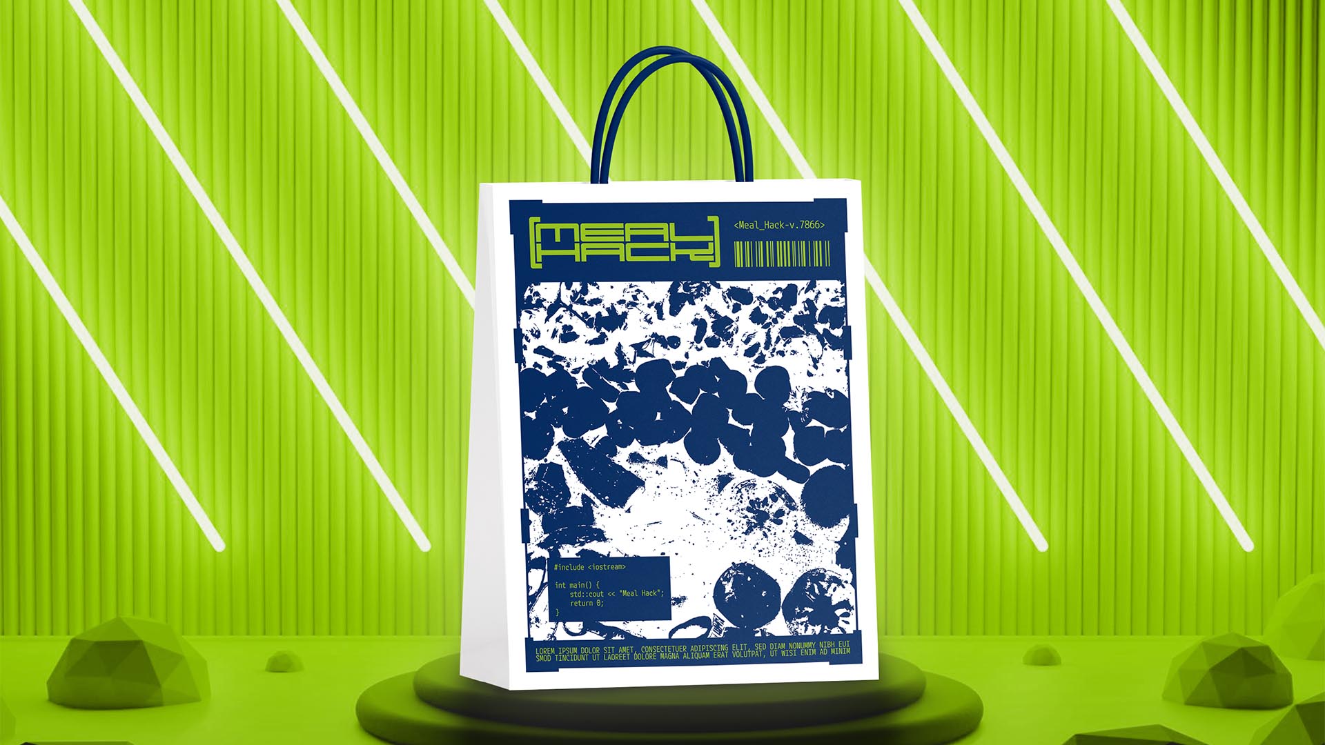
MAIN COLOUR // GREEN: #95C11F, 50-0-100-0
SECONDARY COLOUR // BLUE: #042B60, 100-75-0-25
ACCENT COLOUR // WHITE: #FFFFFF, 0-0-0-0
SPECIAL COLOURS // BLACK: #090400, 60-60-60-100
MAIN FONT // M PLUS 1 CODE REGULAR & BOLD
SECONDARY FONT // NONE
DECORATIVE FONT // NONE
PERSONALITY // CAREGIVER, HERO
PILLARS // A HEALTHY PREMADE MEAL SUBSCRIPTION
PURPOSE // MAKING HEALTHY FOOD ACCESSIBLE
VALUE // THE SHORTCUT YOUR BODY IS ASKING FOR
CLAIM // HACK YOUR MEALS, BOOST YOUR BODY
> BRIEFING // In hopes of finding new ways to make common things as easy as possible Meal Hack came to be. It aims to offer people a way to eat healthy foods without having to do much, thus facilitating a quick physical improvement. It had to show that it's natural and organic, while feeling like it's a hacked way to eat well because of how easy it is.
> APPROACH // What this brand needed was ultimately a unique way to represent that it's health-oriented but without making it look like any other healthy company. With the help of a good research and brand strategy it was decided that it'd be interesting to capitalise on the cyberpunk vibe that the concept of relying on a subscription to eat healthy had.
> SOLUTION // Meal Hack turned out as a brand that uses colours and cryptic illustrations to send a message about their goals, while focusing on the use of cyberpunk-inspired elements to improve the user experience and make it more immersive. This experimental approach helps shape this project's storytelling, giving it the importance it deserves.
> DISCLAIMER // Due to creative considerations certain logo variations, icons, images and / or texts may have been updated, excluded or not designed. Additionally, please note that the projects featured in this website are entirely fictional and have been custom-made in order to protect every client's privacy and anonymity.