NAMING // Neurotechnica
MAIN COLOUR // BLACK: #1A1718, RAL 8022
SECONDARY COLOUR // WHITE: #F1F0EA, RAL 9016
ACCENT COLOUR // NONE
SPECIAL COLOURS // USED FOR HIERARCHY
MAIN FONT // SHARE TECH MONO
SECONDARY FONT // SIX CAPS
DECORATIVE FONT // NONE
PERSONALITY // HERO, ARTIST
PILLARS // STUDYING AND ENHANCING THE BRAIN
PURPOSE // MAKING THE UNIMAGINED A REALITY
VALUE // THE FUTURE AT YOUR FINGERTIPS
CLAIM // TOMORROW'S EVERYDAY TECHNOLOGY
> BRIEFING // Progress often comes by the hand of small groups that strive to see ahead, and this is no exception. Neurotechnica's goal is to use their unique approach to research and development to create tech that can currently only be imagined. Serious as it may sound, they fully believe that having fun is the best way to get things done.
> APPROACH // Upon checking the brand's needs it became clear that it had to be professional but fun, while simultaneously showing expertise. It's for this reason that building a proper strategy helped so much; it defined a solid path to follow afterwards, thus guiding a design that'd be backed by a thorough analysis of several key aspects.
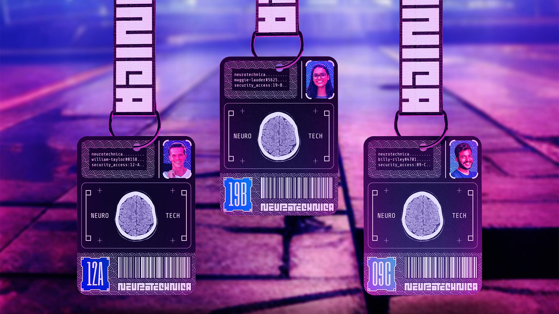
> SOLUTION // In the end, Neurotechnica is the ideal synthesis between seriousness and joy; it combines the traditional Japanese wave pattern, representing good fortune, with images related to their research. It's all tied together by elements that resemble an interface, and a special colour system that helps with user access management.
> DISCLAIMER // Due to creative considerations certain logo variations, icons, images and / or texts may have been updated, excluded or not designed. Additionally, please note that the projects featured in this website are entirely fictional and have been custom-made in order to protect every client's privacy and anonymity.