NAMING // Psypse
MAIN COLOUR // PINK: #FF4081, PMS 205 C
SECONDARY COLOUR // WHITE: #FFFFFF, PMS BLACK 6 C
ACCENT COLOUR // BLACK: #000000, 0-0-0-0
SPECIAL COLOURS // NONE
MAIN FONT // NUNITO SANS REGULAR & BOLD
SECONDARY FONT // NONE
DECORATIVE FONT // NONE
PERSONALITY // INNOCENT, HERO
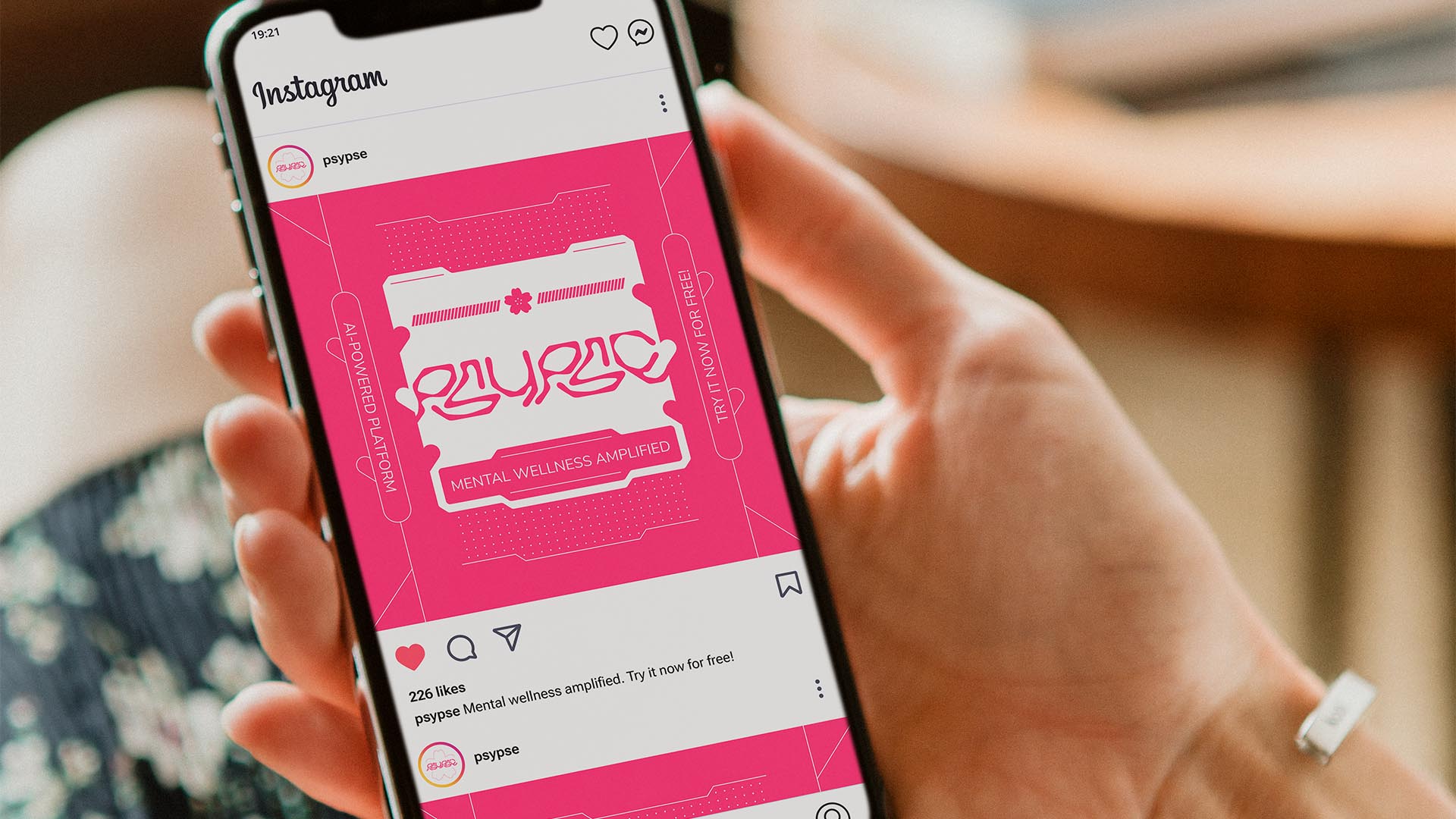
PILLARS // MENTAL WELLNESS AMPLIFIED
PURPOSE // RECONCILE WITH YOURSELF
VALUE // GUIDANCE AT ANY MOMENT
CLAIM // YOUR LOYAL HELPING HAND
> BRIEFING // With AI evolving by the day, its use as a self-care tool is always increasing. Psypse, unlike other tools, is a platform specifically designed for this purpose in a safe way. It needed a brand that would transmit that helpful and kind nature, but wouldn't leave aside the technological aspect that really makes the project stand out.
> APPROACH // Developing something in hopes of helping others comes with the necessity of having a brand that will keep users calm and relaxed. Therefore, a well-thought strategy was a fairly important step to take before building the visual identity. It had to be kind and tech-savvy, but shouldn't feel like it's just another AI tool.
> SOLUTION // In the end, Psypse's visual identity is the result of combining futuristic elements that divide and categorise the information with frequent sakura flower symbolism, known to represent new beginnings and hope. It merges the best of both worlds, giving this project a unique and memorable look that suits its needs in a meaningful way.
> DISCLAIMER // Due to creative considerations certain logo variations, icons, images and / or texts may have been updated, excluded or not designed. Additionally, please note that the projects featured in this website are entirely fictional and have been custom-made in order to protect every client's privacy and anonymity.