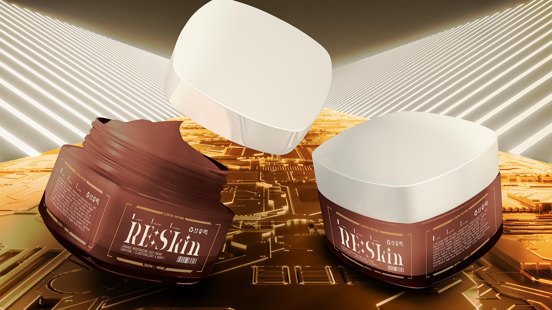
NAMING // RE:Skin
MAIN COLOUR // BROWN: #794D3E, RAL 8002
SECONDARY COLOUR // BEIGE: #E3D9C6, RAL 1013
ACCENT COLOUR // ORANGE: #EB9C52, RAL 1034
SPECIAL COLOURS // NONE
MAIN FONT // ROBOTO MONO REGULAR & BOLD
SECONDARY FONT // NONE
DECORATIVE FONT // NONE
PERSONALITY // RULER, HERO
PILLARS // HIGH-END SKINCARE PRODUCTS
PURPOSE // BEING THE BEST, NOT JUST GOOD
VALUE // POWERED BY THE LATEST TECHNOLOGY
CLAIM // AIM FOR THE STARS
> BRIEFING // Driven by the intention of looking as good as possible, RE:Skin aims to revolutionise the skincare industry. Their groundbreaking use of technology is what sets them apart, so they needed a brand that would take it into account visually, but also strategically. It was vital for them to avoid looking like just another skincare company.
> APPROACH // Important as technology was, there were many elements and considerations to bear in mind. From basic concepts like elegance, layout or brand recognition to whether it matches what the audience is looking for. In the end, the best way to proceed was to first develop a proper brand strategy that'd then guide every future decision.
> SOLUTION // RE:Skin, meaning "restart (your) skin", is a unique twist on a common word aimed at showing the spirit of the brand. While individual elements could give off different vibes out of context, when presented as a whole this feeling fades away due to the brand's cohesiveness as it has the tech-inspired yet elegant look it needed.
> DISCLAIMER // Due to creative considerations certain logo variations, icons, images and / or texts may have been updated, excluded or not designed. Additionally, please note that the projects featured in this website are entirely fictional and have been custom-made in order to protect every client's privacy and anonymity.