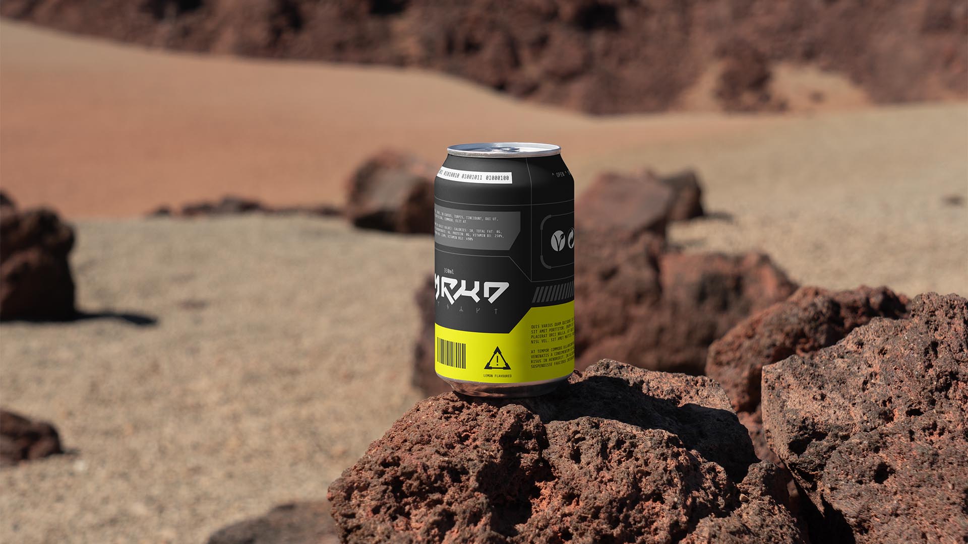
NAMING // RMRKD
MAIN COLOUR // BLACK: #212121, RAL 7022
SECONDARY COLOUR // GREY: #616161, RAL 7012
ACCENT COLOUR // WHITE: #FAFAFA, RAL 9016
SPECIAL COLOURS // USED TO DISTINGUISH FLAVOURS
MAIN FONT // SHARE TECH MONO
SECONDARY FONT // NONE
DECORATIVE FONT // NONE
PERSONALITY // OUTLAW, CAREGIVER
PILLARS // HEALTHY SOFT DRINKS, BUT FUN
PURPOSE // LET'S DEFINE NEW STANDARDS
VALUE // NO SUGARS, NO SECRETS, NO BULLSHIT
CLAIM // DRINK THE FUTURE, DRINK RMRKD
> BRIEFING // The challenge with RMRKD was to build a brand for a healthy soft drink company; something that was simultaneously bold and experimental, but not overwhelming or preachy. It had to be as unique as the product itself, thus having the potential to build quick shelf recognition by staying away from common soda can designs that often get boring fast.
> APPROACH // While building this brand it became evident that learning from those who refuse to make sacrifices would be particularly important. What RMRKD needed was a rebellious yet caring attitude, and that was exactly what was used to build a coherent brand strategy that'd then guide every design-related decision in the right direction.
> SOLUTION // RMRKD, pronounced "remarked", got its name after the concept of giving an opinion; in this case about soft drinks. Its design combines futuristic elements with a thoughtful approach, while simultaneously making use of an experimental technique that allows users to tell flavours apart in a wildly new way that would make them stand out.
> DISCLAIMER // Due to creative considerations certain logo variations, icons, images and / or texts may have been updated, excluded or not designed. Additionally, please note that the projects featured in this website are entirely fictional and have been custom-made in order to protect every client's privacy and anonymity.