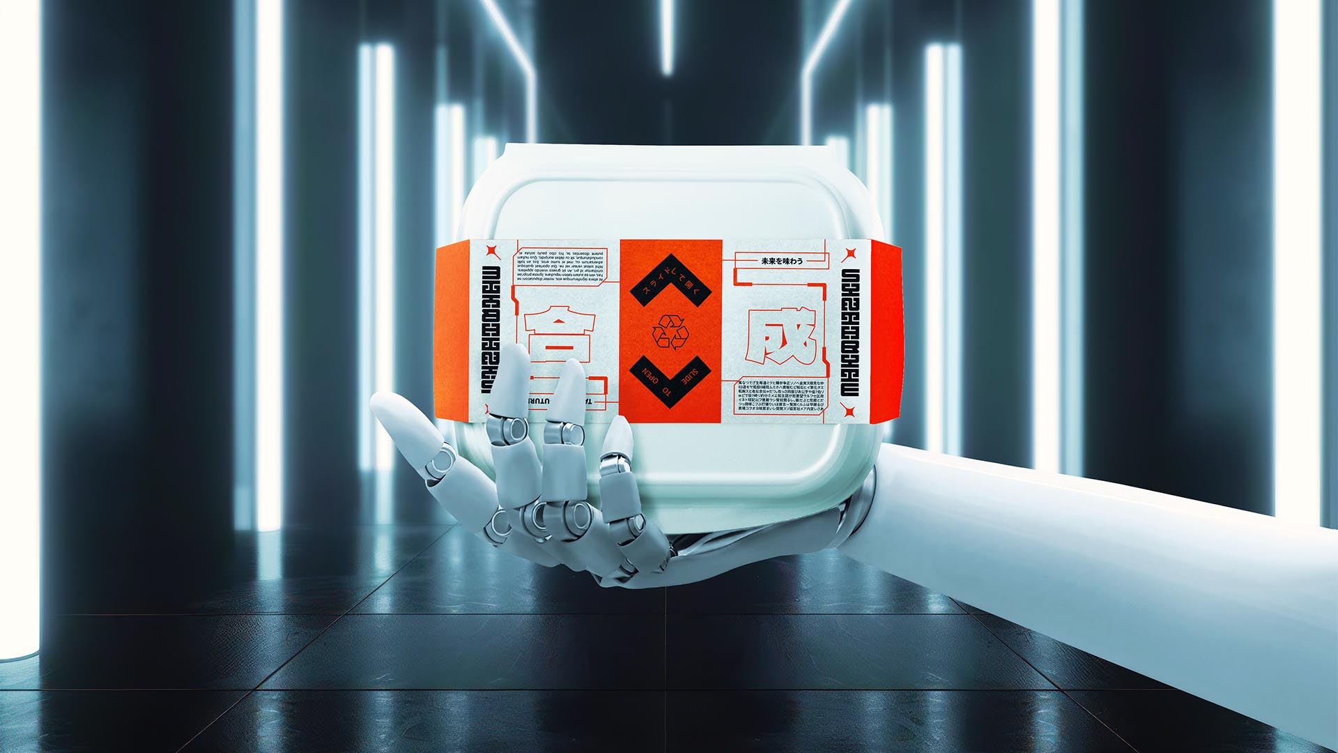
NAMING // Synthbyte
MAIN COLOUR // ORANGE: #FF4D06, RAL 2005
SECONDARY COLOUR // WHITE: #ECECE7, RAL 9003
ACCENT COLOUR // BLACK: #0E0E10, RAL 9005
SPECIAL COLOURS // NONE
MAIN FONT // NOTO SANS (JP) REGULAR & BOLD
SECONDARY FONT // NONE
DECORATIVE FONT // NONE
PERSONALITY // ARTIST, OUTLAW
PILLARS // SYNTHETIC PREMADE FOOD
PURPOSE // INNOVATIVE, AFFORDABLE AND HEALTHY
VALUE // A REVAMP OF THE FOOD INDUSTRY
CLAIM // WE KNOW YOU'LL ENJOY EVERY BITE
> BRIEFING // Inspired by space food, Synthbyte aims to provide healthy premade meals produced synthetically. As one would expect, its brand needed to express this at a glance. As a product that would be sold in supermarkets frequented by both locals and tourists it had not only to stand out, but also offer different language options.
> APPROACH // In order to be able to develop a good brand it was key to first do some proper research on multiple topics related to the company's product and inspiration. It needed something eye-catching and rebellious, but also straightforward and kind. Something different and desirable that anyone would be tempted to to try even if it's just one time.
> SOLUTION // Hierarchy is key here; every element is tied together by a use of shapes and colours that not only makes it interesting and versatile, it also guides clients' eyes and makes sure they won't get confused. As expected, this was done without putting creativity at risk as every element and resource work together towards the same goals.
> DISCLAIMER // Due to creative considerations certain logo variations, icons, images and / or texts may have been updated, excluded or not designed. Additionally, please note that the projects featured in this website are entirely fictional and have been custom-made in order to protect every client's privacy and anonymity.