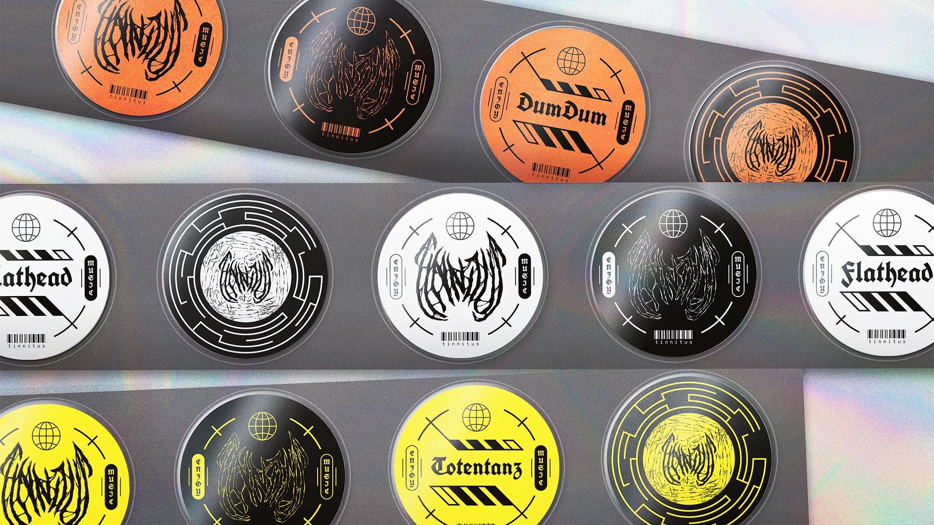
NAMING // Tinnitus
MAIN COLOUR // WHITE: #FFFFFF, RAL 9010
SECONDARY COLOUR // ORANGE: #FF6633, RAL 2008
ACCENT COLOUR // BLACK: #000000, RAL 9005
SPECIAL COLOURS // YELLOW: #F1DD38, RAL 1016
MAIN FONT // ROBOTO REGULAR & BOLD
SECONDARY FONT // UNIFRAKTURCOOK
DECORATIVE FONT // NONE
PERSONALITY // HERO, CAREGIVER
PILLARS // THE MUSIC INDUSTRY MADE EASY
PURPOSE // ALL YOUR NEEDS COVERED
VALUE // MUSICIANS, LEAVE EVERYTHING TO US
CLAIM // FOCUS ON WHAT MATTERS
> BRIEFING // It's no secret that the music industry is oddly complicated, but what if it didn't need to be? Tinnitus intends to go for an entirely new approach, thus helping artist and producers without letting others tell them what to do. Its brand had to be warm and welcoming, yet rough and messy. Coherent, but always innovative.
> APPROACH // Seeing the usual design direction among music labels, distributors and alike made the importance of sticking out clear. Developing a thorough brand strategy was key in order to shape the next steps that needed to be taken; this way, creating a visual identity that's simultaneously coherent and innovative would be much easier.
> SOLUTION // From death metal to Y2K, Tinnitus relies on the perfect blend of many inspirations to find its own, unique style. It's nice and calm, but also full of contrast and elements that would normally not work together. Even its secondary colour is unique, as it's allowed to get replaced by yellow whenever it may be convenient or cool.
> DISCLAIMER // Due to creative considerations certain logo variations, icons, images and / or texts may have been updated, excluded or not designed. Additionally, please note that the projects featured in this website are entirely fictional and have been custom-made in order to protect every client's privacy and anonymity.