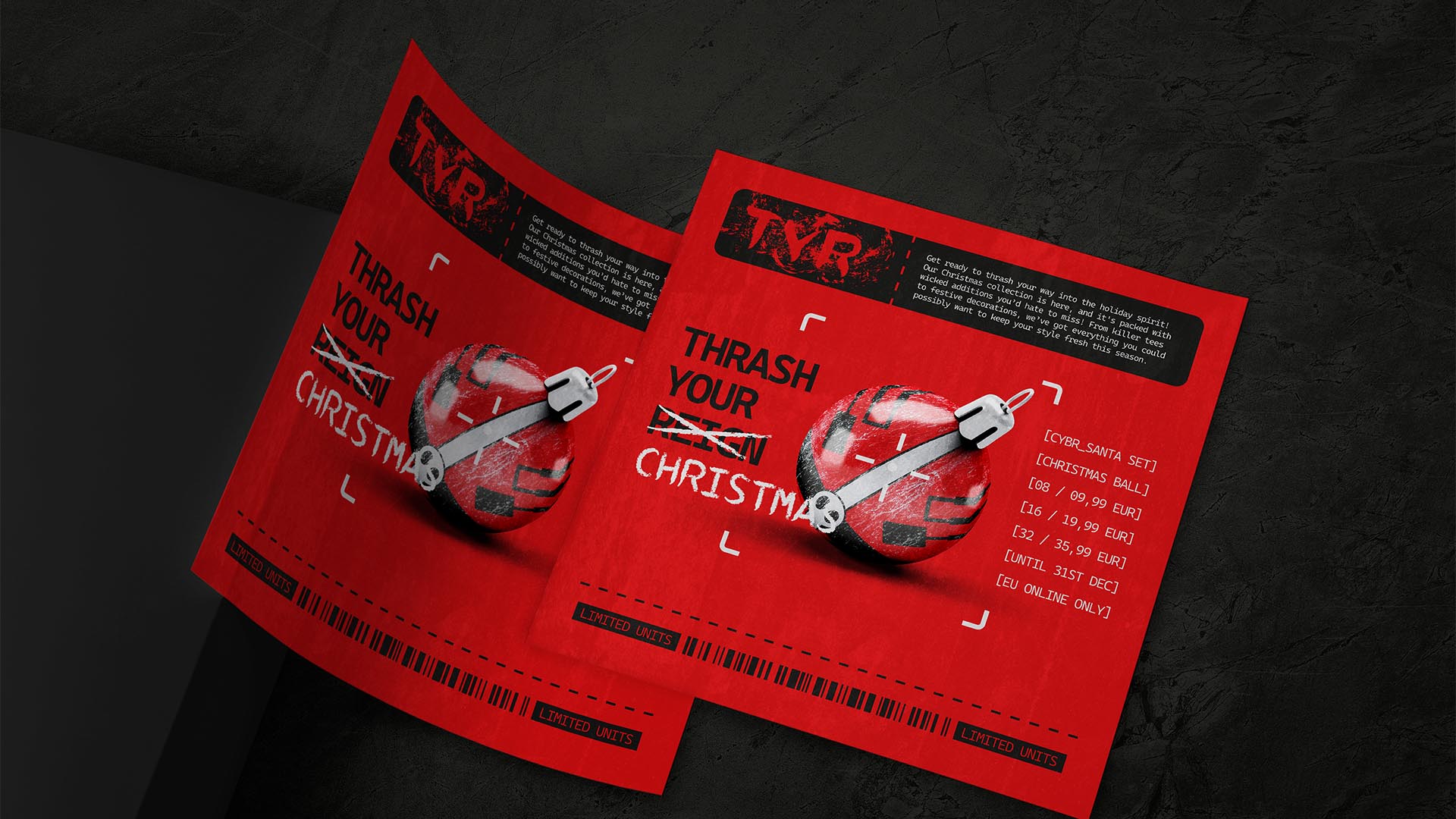
NAMING // Thrash Your Reign, TYR
MAIN COLOUR // RED: #D01618, 13-100-100-0
SECONDARY COLOUR // BLACK: #1D1D1B, 0-0-0-100
ACCENT COLOUR // WHITE: #DADADA, 0-0-0-20
SPECIAL COLOURS // NONE
MAIN FONT // CASCADIA MONO SEMILIGHT & BOLD
SECONDARY FONT // NONE
DECORATIVE FONT // NONE
PERSONALITY // OUTLAW, MAGICIAN
PILLARS // A DARK LIFESTYLE APP AND WEB
PURPOSE // NEW TECH, NEW WAVES, SAME STYLE
VALUE // YOUR WANTS AND NEEDS, THRASHED
CLAIM // YOU NAME IT, WE THRASH IT
> BRIEFING // Thash Your Reign is a project that focuses on offering thrashed versions of regular and trending items for those who don't want to let go of who they are just because there's not a good alternative. Just like their products, this brand needed to prove that they're up to date while being somewhat messed up visually. Effective but fucked.
> APPROACH // This brand needed a rebellious yet neighbourly approach. Not too wild, but definitely not too tame; it had to be able to tell anyone what kind of products they offer while looking rough and gritty. In order to make this succeed it was vital to start off by working on a solid brand strategy that'd guide it from a strategical point of view.
> SOLUTION // Thrash Your Reign, or TYR for short, ultimately resulted in a brand that combines a somewhat traditional design that can be understood easily with a unique vibe that expresses what makes them different, making them stand out fairly while improving immersion. It has the right amount of everything, and its logo is a good example of that.
> DISCLAIMER // Due to creative considerations certain logo variations, icons, images and / or texts may have been updated, excluded or not designed. Additionally, please note that the projects featured in this website are entirely fictional and have been custom-made in order to protect every client's privacy and anonymity.