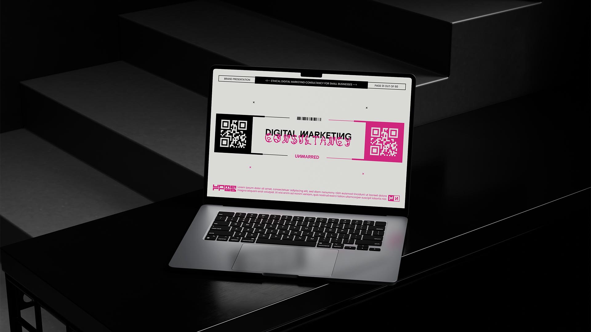
NAMING // Unmarred
MAIN COLOUR // WHITE: #ECECE7, RAL 9003
SECONDARY COLOUR // BLACK: #000000, RAL 9005
ACCENT COLOUR // NONE
SPECIAL COLOURS // MAGENTA: #DC2878, RAL 4010
MAIN FONT // POPPINS REGULAR
SECONDARY FONT // UTARA BOLD
DECORATIVE FONT // KAERU KAERU
PERSONALITY // HERO, INNOCENT
PILLARS // ETHICAL DIGITAL MARKETING
PURPOSE // GUIDING RESPECTFUL GROWTH
VALUE // FIGHTING UNETHICAL STRATEGIES
CLAIM // THEY CARE, YOU CARE, WE CARE
> BRIEFING // As an ethical marketing consultancy Unmarred aims to help small but honest businesses grow and stand out while making them understand the impact their actions have. They needed to express all of this in an effective but experimental brand, something bold that would help them stand out from other marketing consultancies in a responsible way.
> APPROACH // In order to build a fitting brand the first step was to do some research; while ethical design is always a given, it was still important to double check first to make sure that this project wouldn't end up being unsatisfactory. It was just as important to develop a thorough brand strategy to rely on, thus avoiding designing mindlessly.
> SOLUTION // Meaning "free from physical or moral spots or stains", Unmarred not only relies on a unique combination of uncommon typographies and an original approach to secondary colours; it also focuses on a creative use of shapes to distribute information nicely, which results in a experimental brand that's full of details that make it unique.
> DISCLAIMER // Due to creative considerations certain logo variations, icons, images and / or texts may have been updated, excluded or not designed. Additionally, please note that the projects featured in this website are entirely fictional and have been custom-made in order to protect every client's privacy and anonymity.