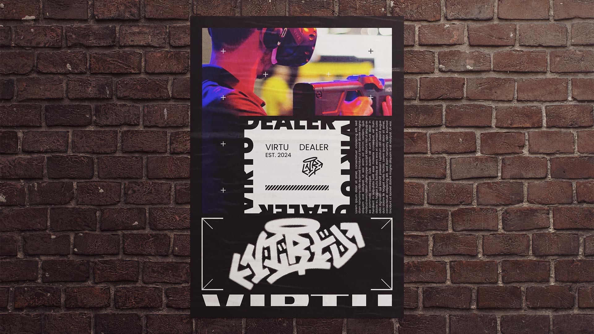
NAMING // Virtu Dealer
MAIN COLOUR // BLACK: #000000, RAL 9005
SECONDARY COLOUR // WHITE: #FFFFFF, RAL 9010
ACCENT COLOUR // NONE
SPECIAL COLOURS // NONE
MAIN FONT // POPPINS REGULAR & BLACK
SECONDARY FONT // NONE
DECORATIVE FONT // NONE
PERSONALITY // EXPLORER, JESTER
PILLARS // EXTREME VR EXPERIENCES
PURPOSE // ADRENALINE BOOSTS AT ANY TIME
VALUE // LIVE YOUR WILDEST FANTASIES
CLAIM // WHERE THE UNFILTERED BEGINS
> BRIEFING // Virtu Dealer originated from the desire and need for adrenaline. As such, their intention is to give anyone who wants it a wild ride, always unfiltered but legal. It needed a bold, disruptive brand that would be as raw as the idea behind it. Taboo but technological, it was important to combine the best of both worlds.
> APPROACH // As something that was made for those who just want to let loose responsibly it had to express a certain amount of safety, but without risking not being bold enough. It also had to be fairly user-friendly, as it's not just aimed at a niche that would enjoy something wildly different. Strategizing and finding good references was key.
> SOLUTION // The end result is a unique design that has brutalism and graffiti as its two main sources of inspiration. This way it manages to be different while approachable, and thanks to its versatility it leaves room for adaptation and innovation. Instead of merging different styles, Virtu Dealer relies on their coexistence to work.
> DISCLAIMER // Due to creative considerations certain logo variations, icons, images and / or texts may have been updated, excluded or not designed. Additionally, please note that the projects featured in this website are entirely fictional and have been custom-made in order to protect every client's privacy and anonymity.